Challenge
Around 2 million people visit the Renfrewshire Council website each year, resulting in around 10 million page views. For many people, the website is their preferred method of contacting the council and completing tasks, but the current digital experience is fractured and inadequately supported by the existing content, design, technology, brands, and ways of working.
The council were looking to improve their digital experience, removing the many difficulties their users were facing. The purpose of the alpha phase was to identify the main pain points, take insights, and ultimately explore and test solutions that could help to achieve their vision.


Approach & Impact
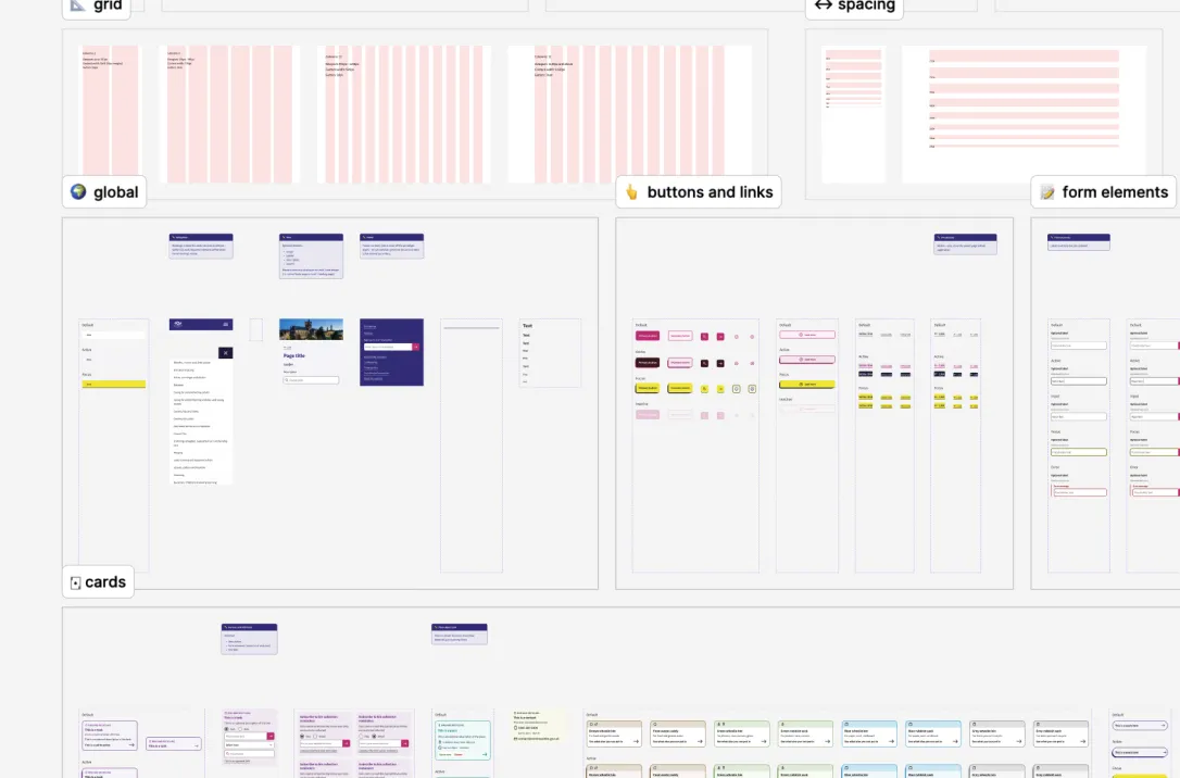
I joined the project with the primary role of UI designer, initially tasked with forming a relevant, user-centred visual language, which translates the Renfrewshire brand for digital application, and incorporates important elements and principles of the Digital Scotland Design System.
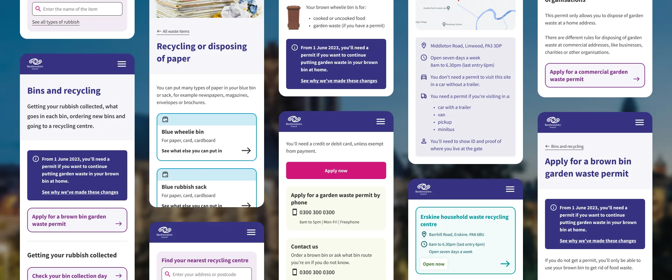
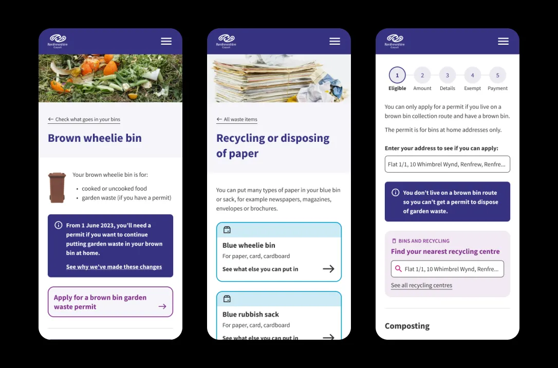
Working closely with service, content and UX designers, I then helped to sketch, wireframe and design prototypes based on the work done during the research and design process. We adopted an object-oriented user experience (OOUX) methodology for this project, a user-centred design approach that builds experiences around the objects in a user’s mental model. The focus of our attention for the alpha phase was bin collections – not so glamorous, but very important to local government service users!
Through iteratively sketching the design, structure and content for the agreed services, we arrived at a set of wireframes which would inform a prototype which we tested with local residents. Where the current site received a System Usability Scale (SUS) score of 50, the new prototype scored 93.3, which is a massive improvement and a validation of the decisions we made during the alpha phase.
Read more about the project activities and outcomes on Renfrewshire Council’s blog.